LightBlog

mercredi 31 août 2022

Lenovo’s new IdeaPad 5i Chromebook has a fast 120Hz display

Lenovo has launched a new Chromebook, two new Android tablets, and a new series of monitors at the IFA show in Berlin. The new IdeaPad 5i Chromebook is Lenovo’s first 16-inch Chromebook with a 120Hz display. Alongside it is the second generation Tab P11 Pro and Lenovo Tab P11 which are getting slight technical improvements. Capping out the announcements are five monitors, focused on the needs of both gamers as well as those looking to stay productive.

IdeaPad 5i Chromebook

The highlight of the announcements for most people will be the IdeaPad 5i Chromebook. This is a significant addition to Lenovo’s Chromebook lineup, as it’s the first that is 16-inches in size, but it doesn’t have a launch date or price in the United States. It is a decently specced machine, though.

The IdeaPad 5i Chromebook sports a 2.5K resolution borderless display, with a refresh rate of 120Hz, which will make the content on the screen look fluent and fast. This refresh rate isn’t quite common on Chromebooks, either, which makes it extra special.

Powering the device are Intel Core i3-1215U or Intel Pentium 8505 CPUs and either 4GB or 8GB of RAM. For storage, you can choose between an eMMC or an SSD. the eMMC options include 64GB or 128GB, and traditional SSDs will come in 256GB or 512GB.

There’s also an FHD webcam on board, and two user-facing speakers for added immersive feeling. Weight comes in at 4.10 pounds and the Chromebook is about 0.8 inches thick. Ports range from 2 USB-A Type-C ports, 2 USB 3.2 Type-A ports, a headphone jack, and a MicroSD card slot.

Lenovo Tab P11 Pro (2nd Gen) and Lenovo Tab P11 (2nd Gen)

The other two addition’s in Lenovo’s IFA launch are the second generation Tab P11 Pro and Lenovo Tab P11. The Tab P11 Pro will start at $400 and will come in September 2022. The Tab P11 will start at $250 and will come in January 2023. Both of these are generational improvements with slight jumps in processing power.

The Tab P11 Pro 2nd Gen will be Lenovo’s new flagship Android tablet, replacing the first generation when launched. It keeps a lot of the same design features as the first version but gets a bump in specs. Now onboard is the MediaTek 1300T SoC which Lenovo says can offer 120% more power than the last generation. RAM and storage options will range from 4GB of RAM and 128GB of storage, 6GB of RAM and 128GB of storage, or 8GB of RAM and 256GB of storage. The screen is still bright and vibrant, keeping an 11.2-inch 2.5K resolution OLED panel with up to a 120Hz refresh rate. The optional keyboard case is also unchanged, as is the Lenovo Precision Pen 3. Ports are just a single USB Type C, which was a complaint that wasn’t addressed from the last generation.

The Lenovo Tab P11 2nd Gen is the cheaper version of the P11 Pro. It comes with the MediaTek Helio G99 under the hood, for a 50% boost in power between generations. RAM and storage options include 4GB RAM and 64GB of storage, 4GB of RAM and 128GB of storage, or 6GB of RAM and 128GB of storage. It has a slightly less vibrant IPS display, but in a lower 2K resolution but still with the 120Hz refresh rate.

Both tablets are guaranteed to get two major Android OS updates up to Android 14. Lenovo will also include a subscription to Nebo, which is a note-taking, and drawing, app. MyScript is also included, which is a calculation tool.

Lenovo Legion Y32p-30 Gaming Monitor

As for the gaming monitor, Lenovo is launching the Legion Y32p- 30. This is a 31.5-inch display that has a 144Hz refresh rate, and 0.2ms response time. Of course, it’s 4K resolution, too, and has some bonus features like a sensor that can detect the brightness to adjust the screen for the best viewing depending on the time of day. RGB lights can be found under the bezel, too. The main ports include 2 x HDMI 2.1, 1 x DisplayPort 1.4, and a USB Type-C.

Note that Lenovo is including joystick navigation on this monitor. This has been a top requested feature and makes navigating the menus easier. The stand is ergonomic and can swivel, pivot, and move up and down. A cell phone holder is included at the bottom front of the stand for convenience.

The Lenovo Legion Y32p-30 Gaming Monitor is expected to start at $750. It will come in December of 2022.

New ThinkVision Monitors

Capping out Lenovo’s announcements are a series of new ThinkVision monitors. The notables on the list include the T34w-30, T32p-30, and the S25e-30.

If that confused you, don’t worry. Of the bunch, the most interesting is the ThinkVision T34w-30. This monitor is a 34-inch WQHD resolution display with a 21:9 aspect ratio and 1500R curve. This is a widescreen display for multitasking, which is why the refresh rate will cap out at 60Hz. Ports include USB Type-C, HDMI 2.0, and DisplayPort 1.4.

The ThinkVision T32p-30, meanwhile, is a new Lenovo monitor catered more toward everyday users. With slim bezels, it has a 31.5-inch panel tuned at 4K resolution.

Last up is the ThinkVision S25e-30. This is a monitor for small businesses. It sports a 24.5-inch panel at 1920 x 1080 resolution. The monitor can cover 99% sRGB color gamut and has a 75Hz refresh rate. Connectivity options include VGA, HDMI 1.4, and 3.5 mm audio out.

The ThinkVision T34w-30 Monitor starts at $849.00 and is expected to become available in January 2023. The ThinkVision S25e-30 starts at $179 and will come in January 2023. Lastly, the ThinkVision S25e-30 will start at $849 and will come out in January 2023.

The post Lenovo’s new IdeaPad 5i Chromebook has a fast 120Hz display appeared first on XDA.


from XDA https://ift.tt/tE2k5Hq
via IFTTT

Apple iPhone 14 Pro may relocate privacy indicators to the hole-and-pill cutout

Rumors have been swirling since the beginning of the year about Apple replacing its iconic notch with a hole-and-pill cutout on the iPhone 14 Pro. As we get closer to the announcement of the next iPhones, we are hearing more and more news about how Apple may utilize the new design. While filling in the cutout with black seemed like a strange idea initially, we are getting new details about how Apple may use the blacked-out area.

According to 9to5Mac, Apple will use the newly created space between the hole-and-pill to relocate the green and orange indicators that are currently on the iOS status bar. If you’re unfamiliar with these indicators, they were added in iOS 14, giving users a visual representation of when the microphone or camera was in use. If the camera was in use, a green indicator dot appeared in the status bar. The same would apply to the microphone, with an orange indicator appearing in the status bar when in use.

Pill and Hole Cut out with dots and revamped camera app for iPhone 14 Pro

The problem with the current design is that both indicators cannot appear simultaneously, even if the camera and microphone are being used. If you are using an app that utilizes both, it turns orange and quickly shifts to green. The source states that with the upcoming change, iOS will be able to show both indicators at once. Additionally, Apple plans to allow users to tap on these indicators to see a list of which apps are using or have used the camera or microphone.

Furthermore, Apple may also redesign the Camera app, moving the advanced features to the top of the display. Currently, they reside in a sub-menu near the bottom near the shutter button. The change will give users more screen real estate, dedicating more of the display to the camera’s live preview. The source indicates that these new changes are being tested and that Apple plans to implement them in a future version of iOS. But, since they are in testing, there is always a possibility that they could be removed. Thankfully, we won’t have to wait long to find out, as Apple will hold its “Far Out” event on September 7.

Apple’s iPhone 14 Pro may use the hole-and-pill cutout to relocate privacy indicators.


Source: 9to5Mac

The post Apple iPhone 14 Pro may relocate privacy indicators to the hole-and-pill cutout appeared first on XDA.


from XDA https://ift.tt/U9D0wWh
via IFTTT

Going forward, Oppo will stop including chargers with some of its products

Over the past few years, many smartphone manufacturers have stopped including charging adapters with their phones. Apple is perhaps best known for being one of the first to start this trend, and soon many followed. While Oppo was a long time hold out, the company has now confirmed that it will also abandon the charger, withholding it from some of its products that will be released over the coming year.

The news was shared during the company’s European launch event of the Oppo Reno 8 Pro, the Reno 8, and the Reno 8 Lite. Billy Zhang, who is Oppo’s vice president of overseas sales and services, relayed the new strategy to press in attendance, stating, “We will take the charger out of the box in the next year for several products. We have a plan.” Oppo is in a precarious position considering that it has been working on and building up its proprietary charging technology, VOOC, and Super VOOC, since 2014. The company has included the adapters with many of its phones, allowing its devices to charge faster and more efficiently than the competition.

Zhang addressed this by stating, “It’s not that easy for consumers to get access to [SuperVOOC chargers], so we have to keep it in the box. However, as we are expanding our business operations, we are looking to taking chargers out of the box and put them in the store so that our users are able to buy the chargers and continue using them even when they upgrade their devices.” Unfortunately, Zhang didn’t dive any further into the subject, so it is unknown as of now what products will be affected. Of course, “the plan” could involve any number of moves, that will undoubtedly require numerous considerations.

As Oppo aligns itself with other companies by removing charging adapters from its products over the coming year, Zhang didn’t explain why the company was shifting its strategy. But like most of its competitors, the reason is usually linked to environmental reasons. Apple first announced it was removing chargers from its boxes with the launch of the iPhone 12. At the time, the company cited that:

Power adapters use the largest amounts of certain materials. Using smaller, lighter packaging lets us fit up to 70% more iPhone boxes per shipping pallet, which helps further reduce our carbon footprint. Eliminating power adapters from device packaging lets us avoid more than 2 million metric tons of carbon emissions, equivalent to removing 500,000 cars from the road for a year. Leaving out those adapters was a bold change for Apple and a necessary one for our planet.

Going forward, Oppo will also have to make bold decisions, deciding on what devices will and will not include charging adapters. While it is a big move for the company, one can only wait and see how its customer will react.


Source: Android Police

The post Going forward, Oppo will stop including chargers with some of its products appeared first on XDA.


from XDA https://ift.tt/6unH5Mb
via IFTTT

How to customize notification settings on Windows 11

Notifications can be a hugely important feature on our laptops, just like they are on our smartphones. They let us know when something needs our attention, and if you get distracted easily, that can help you stay on track. However, as we install more and more apps, notifications are constantly competing for our attention, and sometimes you just want to focus. Thankfully, you can customize notification settings in a variety of ways on Windows 11, and we’re here to help.

In this guide, we’re going to take a closer look at the options you have to customize notifications on Windows 11. These can help you make notifications less intrusive and allow you to focus on what’s truly important to you. With that established, let’s get right into it.

Navigate this article:

Customize general notification settings

Let’s start with the basics of notification settings. First off, if you want to get to notification settings on Windows 11, there are two ways to do it. The quickest way is to right-click the date and time section in the corner of your taskbar, then choose Notification settings.

Screenshot of the context menu that appears when you right-click the date and time section of the taskbar in Windows 11. The notification settings option is highlighted by a red outline.

Alternatively, you can use the Start menu to open the Settings app, then choose Notifications in the System section (which opens by default).

Here, you’re presented with an overview of your notification settings. You can disable notifications altogether, or click the first option, Notifications, to expand a drop-down menu. This menu has some additional options, such as turning off notification sounds. You can also choose whether you want notifications to show up on the lock screen, including a specific setting for reminders and incoming calls. Below that, there’s Focus assist, the Windows equivalent of Do not disturb. We’ll look at that in a bit.

The top of the Notifications page in the Windows 11 Settings app

You can also enable or disable notifications for each app. The apps shown here are only the ones that have sent you at least one notification, so the list may not show apps you just installed. You can click each app to go into more specific settings for that app, but we’ll explore that later.

At the bottom of the page, you can also find settings for certain notifications from the Windows system itself. For example, you can turn off suggestions on how to use certain features, or whether you want to see the Windows welcome experience after installing a new feature update. This welcome experience can teach you about new features in the update, so it can be useful, but it’s not for everyone.

Screenshott of the bottom of the Notifications page in the Windows 11 Settings app. Notification settings for Windows features are highlighted with a red outline.

Focus assist

Focus assist is the Windows 11 equivalent of Do not disturb, and it can block almost all incoming notifications as long as it’s enabled. When you clock the Focus assist option in the page shown above, you can customize various settings related to that feature. For starters, you can choose to leave it off, or use the Priority or Alarm settings. Priority mode lets you choose certain notifications that can break through Focus assist, while Alarm mode only lets alarms through.

There’s also an option here to let you see notifications you missed while Focus assist was on. With this enabled, when you disable Focus assist, you’ll see a notification with a summary of everything you missed.

Screenshot of the Windows 11 Focus assist settings page

Below these options, you a section for automatic rules, which are certain situations where Focus assist will kick in automatically. There are options to enable it during a specific time of the day, along with more special rules, such as when you’re duplicating your display or while running a full-screen app. These can be useful so you don’t get awkward notifications while you’re presenting your screen, or if you don’t want to get interrupted while playing a game. Oddly enough, there’s also a rule to disable notifications for the first hour after installing a feature update, and it’s enabled by default.

If you click any of these rules, you can choose whether you want Focus assist to turn on in Priority mode or Alarm mode, and you can also choose whether you want to be notified when Focus assist is enabled automatically.

Screenshot of the Windows 11 Settings app displaying the configuration page for the automatic rule that enables focus assist when duplicating the display.

Customizing your priority list

As mentioned above, one of the options Focus assist offers is called Priority, and this allows select apps to still send notifications if you consider them important. If you click Customize priority list, you can choose to allow VoIP calls to come through, as well as reminders. Then, of course, you can choose specific apps you want to add to your priority list, so notifications from those apps are always shown. A few apps are added by default, but you can remove them or add some others.

Screenshot of the Focus assist priority list settings in the Windows 11 Setttings app

There’s also a section on this page to allow notifications from certain people to break through. This is based on the People app, however, which is basically unusable nowadays, and it only includes Outlook contacts. It doesn’t even work with Microsoft Teams contacts, despite the app being built into Windows 11.

Customize per-app notification settings in Windows 11

Finally, let’s talk about notification settings for individual apps. As we mentioned above, the notifications settings page (Settings -> System -> Notifications) lets you turn notifications on or off for each app. However, you can also click an app’s name to see more detailed notification settings for that app.

For example. let’s go with Microsoft Teams, since it’s built into Windows 11. When you open the notification settings for that app, you see a few options. First off, you can choose whether you want notification banners to show up – those are the little pop-ups that show up on the bottom right corner of your screen. You can also choose whether you want those notifications to be visible in the notification center, which you can open by clicking the date and time on your taskbar (or by pressing the Windows key and N on your keyboard).

Notification settings for the Microsoft Teams app on Windows 11

Other options let you hide notification contents on the lock screen, so people can’t see your notifications without entering your password or PIN. You can also turn off notification sounds and choose the priority level of notifications from that app. A higher priority means notifications will be shown at the top of the notification center, and if you receive multiple high-priority notifications, you can also see up to three of them pop up on screen at once, as opposed to just one for normal notifications.

Notification settings in Windows 11 version 22H2

So far, we’ve talked about the notification settings in the original release of Windows 11, but you may already be running Windows 11 version 22H2. This is the first feature update to Windows 11, and it comes with a few important changes to notification settings. In this version, if you go to the notification settings page (Settings  -> System -> Notifications), things look a bit different, but most of the functionality is the same.

For starters, Focus assist has been renamed to Do not disturb, so it aligns with what you probably already know from other platforms. It’s been simplified, too, so it’s either on or off, and you can no longer choose between Priority or Alarms mode. Plus, all the Do not disturb settings are now directly available in the notifications page, without taking you to a separate page entirely.

Sreenshot of notification settings in Windows 11 version 22H2

It’s also worth noting that the page where you customize the priority list has been updated with a new design, and it removes the useless People section we mentioned above.

Priority list settings in Windows 11 version 22H2

Focus

Something new you will notice in the new Notifications page is the Focus option. This is where you can choose options related to focus sessions, a feature that was introduced with Windows 11 as part of the Clock app. In this page, you can start a focus session, choose how long it will last, and hide taskbar notification badges and flashing (when an app on the taskbar turns orange to get your attention).

Focus settings in Windows 11 version 22H2

When you start a focus session, it will enable the settings you choose on this page. You can learn more about the Clock app with focus sessions in our deep dive if you’re interested in that.


And that’s all you need to know about how to customize notification settings on your Windows 11 PC. If you’re keen on learning more about Windows 11, we have a few other guides for you. We have an general guide on how to use Windows 11 as a whole, which is a great starting point for new users.

The post How to customize notification settings on Windows 11 appeared first on XDA.


from XDA https://ift.tt/qkl2jQO
via IFTTT

OnePlus 10T vs Samsung Galaxy S22: Two great Android value-flagship options

Samsung’s base model of the Galaxy S22 has been one of the best “affordable flagships” for most of 2022, but a new challenger arrives in the form of the OnePlus 10T, which brings a newer top-of-the-line Qualcomm chip, along with the usual 120Hz OLED displays and premium build quality, at a slightly lower price point.

    OnePlus 10T
    The OnePlus 10T is a new almost flagship that punches way above its price range.
    Samsung Galaxy S22
    The Samsung Galaxy S22 is Samsung's base model flagship phone, and while it loses the awesome zoom lens and S-Pen, it's still a very good flagship phone.

Navigate this article:


OnePlus 10T vs Samsung Galaxy S22: Specifications

Specifications Samsung Galaxy S22 OnePlus 10T
Build
  • Aluminum mid-frame
  • Gorilla Glass Victus front and back
  • Plastic mid-frame
  • Gorilla Glass 5 front and back
Dimensions & Weight
  • 146 x 70.6 x 7.6 mm
  • 168 gram
  • 163 x 75.37 x 8.75mm
  • 203.5g
Display
  • 6.1″ AMOLED
  • 1080 x 2340 pixels
  • variable refresh rate up to 120Hz
  • 6.7-inch FHD+ Fluid AMOLED
  • 120Hz refresh rate with adaptive refresh rate (60Hz/90Hz/120Hz)
  • Corning Gorilla Glass 5
  • Qualcomm Snapdragon 8 Gen 1 (US, China, India and other regions)
  • Exynos 2200 (Europe, South America and other regions)
  • Qualcomm Snapdragon 8 Plus Gen 1
RAM & Storage
  • 8GB RAM
  • 128GB/256GB
  • 8GB
  • 128GB/256GB
Battery & Charging
  • 3,700mAh
  • 25W Wired fast charging (charger not included in box)
  • 15W wireless charging
  • 4,800mAh
  • 125W wired fast charging support (North America)
  • 150W wired fast charging support (International)
Security Ultrasonic in-display fingerprint scanner Optical in-display fingerprint scanner
Rear Camera(s)
  • Primary: 50MP wide, f/1.8
  • Secondary: 12MP ultra-wide, f.2.2
  • Tertiary: 10MP telephoto, 3x optical
  • Primary: 50MP f/1.8 Sony IMX766, OIS
  • Ultra-wide: 8MP f/2.2, 119.9-degree FoV
  • Macro: 2MP
Front Camera(s) 10MP 16MP
Port(s) USB-C USB-C
Audio Stereo speakers Stereo speakers
Connectivity
  • 5G (mmWave)
  • Wi-Fi 6 (802.11ax) with 2×2 MIMO
  • Bluetooth 5.2
  • NFC
  • 5G (mmWave)
  • Wi-Fi 6 (802.11ax) with 2×2 MIMO
  • Bluetooth 5.1
  • NFC
Software OneUI 4.3 over Android 12 OxygenOS over Android 12
Other Features Dual physical SIM Dual physical SIM

OnePlus 10T vs Samsung Galaxy S22: Hardware and Design

OnePlus 10T 5G in Jade Green and Moonstone black colorway

Both the OnePlus 10T and Galaxy S22 sport a cool-looking design in which one side of the camera module blends into the frame. Although I personally like the OnePlus’ look a bit more, I must give credit to Samsung for pioneering this design, as it first debuted in 2021’s Galaxy S21 series. The Galaxy S22 is a typical glass-and-aluminum slab, while the OnePlus 10T uses glass front and back too, but the frame is plastic.

Samsung’s phone also has a slightly newer version of Gorilla Glass reinforcement (Victus), while the OnePlus 10T uses Gorilla Glass 5. If you want to get a case for your OnePlus 10T, we have curated a selection of the best cases here.  We got you covered if you want S22 cases too.

Display

The OnePlus 10T is a much bigger device, thanks to its 6.7-inch screen compared to the Galaxy S22’s 6.1-incher. Both screens look great, 120Hz panel using some of the latest OLED technology for deep blacks and punchy reds. But the Galaxy S22’s screen is a tad better, with a bit higher maximum brightness and a larger range of variation between refresh rates (as low as 24Hz all the way to 120Hz).

The OnePlus 10T panel is no slouch, it’s also vibrant with zippy animations (and its refresh rate can be either 60Hz, 90Hz, or 120Hz). But the Galaxy S22 screen takes the win by a hair.

s22 oneplus 10t front display

SoC, memory, and battery

Since the Galaxy S22 came out at the beginning of the year, it runs on a slightly older chip, the Qualcomm Snapdragon 8 Gen 1, compared to the 8 Plus Gen 1 powering the OnePlus 10T. The newer Plus chip is marginally more powerful but noticeably more energy efficient. This, plus the much larger battery cell in the 10T (4,800 mAh) means OnePlus’ phone gets better battery life than the Galaxy S22’s 3,700 mAh battery.

Both phones come with 8GB of RAM and storage starting at 128GB. The OnePlus 10T can double both RAM and storage to 16GB and 256GB, while the Galaxy S22 can only double storage — the RAM stays at 8GB. It shouldn’t matter much to be honest, as 8GB RAM is more than plenty in 2022.

Cameras

The Galaxy S22 comes with a triple-lens system with three actual useful lenses covering the wide, ultra-wide, and 3x zoom focal range. The main camera is a 50MP Samsung GN5 sensor with a 1/1.5-inch image sensor size, and the camera is used to capture sharp pixel-binned images. The ultra-wide is a 12MP shooter with a wide 122-degree FoV, and finally, a 10MP 3x telephoto zoom lens.

galaxy s22 camera module

The OnePlus 10T also has a trio of rear-facing cameras, but one of the lenses is the rather useless 2MP macro sensor that’s more for show. The 8MP ultra-wide sensor is also a bit low in pixel count, so images are softer in low-light scenes. But at least the 10T’s main camera is good: a 50MP Sony IMX766 sensor with the same 1/1.5-inch image sensor size as the Galaxy S22’s main camera. In terms of main camera performance, both phones are very good and just about neck and neck. But the Galaxy S22 clearly wins in zoom and ultra-wide photography.

back of the oneplus 10t

The 10T also takes a slight win in selfies, as its 16MP shooter is not more pixel-dense, but OnePlus doesn’t apply heavy skin brightening filters the way Samsung’s phones all do. Still, overall, the Galaxy S22 camera system is superior.


OnePlus 10T vs Samsung Galaxy S22: Software

Android 12 is the name of the game here for both phones, and each runs on the company’s own Android skin. Samsung’s OneUI is more feature-packed, allowing you to open apps in a resizable floating window and output a PC-like layout to an external display. But OnePlus’ OxygenOS is a more visually mesmerizing UI, with animations that look not only faster but more fluid to the eyes. A lot of this is an illusion — OxygenOS has always prioritized how animations look, but I can’t deny basic smartphone tasks like jumping in and out of apps, or even bringing down the notification tray, appears more pleasing to my eyes in OnePlus phones than Samsung phones. However, the inability to open apps in a floating window (you can only do split-screen multi-tasking on OxygenOS) is a bit limiting for someone who likes to multi-task often such as myself.

About page on OxygenOS 12 Settings page on OxygenOS 12 Multitasking on OxygenOS 11 oneui screenshot oneui screenshot Samsung Settings

Neither software get in the way of core Android much, so all the usual Android 12 features are here. Ultimately, this comes down to preference: do you want beautiful, buttery smooth animations, or more features? Samsung DeX has proven legitimately useful at times when I’m trying to do work on the road.

One final benefit for Samsung: the South Korean tech giant promises at least four years of Android software updates, while OnePlus is only guaranteeing three years. If you use your phone for years at a time, this could play a factor.


OnePlus 10T vs Samsung Galaxy S22: Performance

Other than battery life — which is a clear win for the OnePlus 10T due to having a more efficient chip and larger battery size — general performance will be similar for both phones, despite the OnePlus 10T running on a slightly more capable chip, with a 7% better CPU clock speed and 10% more efficient GPU. The reality is you won’t see the difference doing 99% of normal daily tasks like texting, emailing, or reading words on a website.oneplus 10t camera

Both phones have excellent haptics and stereo speakers, though the OnePlus 10T is a better media consumption or gaming device due to having a larger screen and a bit more efficient GPU. The Galaxy S22 is superior as a multi-tasking productivity machine, however, due to OneUI’s ability to open apps in resizable windows and Samsung DeX.

If you care about benchmarks, the OnePlus 10T obviously scores higher in Geekbench due to having the newer chip. You can see in the screenshots below the newer Snapdragon 8 Plus Gen 1 particularly wins in multi-core performance. Either way, these are both very much flagship-level phones and they are not lacking in power.


OnePlus 10T vs Samsung Galaxy S22: Which phone should you buy?

The OnePlus 10T is a bit more affordable at $649 compared to the Galaxy S22’s $799. However, the latter is Samsung’s official retail price, there are deals on Amazon that lowers the Galaxy S22 to $699. The OnePlus 10T may have some deals too, so do check around.

    Samsung Galaxy S22
    The Samsung Galaxy S22 is Samsung's base model flagship phone, and while it loses the awesome zoom lens and S-Pen, it's still a very good flagship phone.

Whether saving $50-$150 is a big deal or not depends on your spending power. We do think the Galaxy S22 is a slightly more polished device due to having a better camera system, brighter screen, and longer guaranteed years of software updates, but the OnePlus 10T has more fluid animations, a larger screen for media consumption, and better battery life.

    OnePlus 10T
    The OnePlus 10T is a new almost flagship that punches way above its price range.

galaxy s22

Either way, both phones are very good and if you’re on the market for a flagship-level phone but don’t want to pay close to $1,000, either of these will serve you well. If you want me to share which phone I would pick, I would pick the OnePlus 10T if the price gap is $150, but I’d take the Galaxy S22 if the price gap is just $50.

The post OnePlus 10T vs Samsung Galaxy S22: Two great Android value-flagship options appeared first on XDA.


from XDA https://ift.tt/NxiY0XW
via IFTTT

Microsoft adds 14 new functions to Excel and more in August

As we’re nearing the end of the month, Microsoft has rounded up the new features it added to Excel during August. These roundups include features for users in the stable channel, as well as Insider channels, and they cover all platforms Excel is available on. One of the highlights this month is the general availability of 14 new functions, mostly focused on text manipulation and dynamic arrays.

Starting with those new functions – which are available across the web, Windows, macOS, and mobile versions of Excel – they’ve been available to Insiders since March, but now they’re rolling out to everyone. Two new functions are TEXTBEFORE and TEXTAFTER, which let you output text from a cell only up to or from a specific point, simplifying the information in them. There’s also a TEXTSPLIT function that lets you split the text in one cell into two or more cells.

Other functions are related to dynamic arrays, which are also a relatively recent feature in Excel. These new functions let you combine, reshape, or resize arrays, so you can organize your data in a way that’s easier to understand.

Aside from this, the bulk of the changes seem to be in Excel for the web. The bigger changes including support for editing spreadsheets with legacy shared workbook features, as well as legacy data connections. Excel for the web also now supports Power Queries for Groups and you can also now create PivotTables that link directly to Power BI datasets. That last feature is also available in Excel for Windows if you’re in the Office Insider Beta channel.

The web version of Excel also now has a multi-line formula bar, and it supports rich text formatting in cells, so you can apply formatting changes only to specific parts of a cell.  Microsoft has also made it easier to delete data series from a chart by simply clicking the data series and pressing the Backspace key on your keyboard.  Finally, you can also now sort rows by color or icon.

On other platforms, most of the changes are exclusive to Office Insiders. If you’re in the Current Channel Preview on Windows, you can also use the new Show changes button, which lets you see the history of changes made to the entire workbook.

A screenshot of an Excel spreadsheet where one cell contains a link to an image file, and another cell uses the IMAGE function to display that image.

On Windows, macOS, Android, and iOS, you can now display images directly inside a cell using the new IMAGE function to link to an image resource, as long as you’re in the Beta channel.

And that’s about it for the new Excel features Microsoft added in August. If you’re not an Office Insider, most of these features will likely be available in the next month or two, but we’ll have to wait to know for sure. Of course, as we’ve mentioned, the new features in Excel on the web are available to everyone now.


Source: Microsoft

The post Microsoft adds 14 new functions to Excel and more in August appeared first on XDA.


from XDA https://ift.tt/Wzb1Oop
via IFTTT

Logitech’s cloud gaming handheld could pack the Snapdragon 720G and a 6,000mAh battery

Logitech is working in partnership with Tencent to bring a new cloud gaming handheld to the market later this year. While the company is yet to release any details about the device, a recent leak gave us our first look at its design. Now, we have a few details about its hardware.

A Google Play Console listing of the Logitech cloud gaming handheld reveals that the device will have the model number GR0006 and will pack the Qualcomm SM7125 SoC (AKA the Snapdragon 720G), the Adreno 618 GPU, and 4GB of RAM. The listing also reveals that the device will run Android 11 out of the box, and it includes a render that confirms the design we saw in the recent leak.

Logitech G Cloud Gaming Handheld Google Play Console listing screenshot.

Via: Kuba Wojciechowski

An FCC listing of a Logitech device with the same model number further adds that it will pack a 6,000mAh battery and Wi-Fi 5 support. While there are no mentions of a cellular variant in the FCC listing, it does reveal that the device will likely be called Logitech G Cloud Gaming Handheld. A USPTO listing of the device also confirms this moniker.

Based on these specs, we suspect that the Logitech G Cloud Gaming Handheld might just be an affordable console exclusively for cloud gaming services. It might not be great for mobile games, however, due to the older Snapdragon 720G chip, Adreno 618 GPU, and 4GB of RAM. If that’s the case, the Logitech G Cloud Gaming Handheld might prove to be a tough sell compared to a mid-range smartphone with a gaming controller.

Would you pick a dedicated cloud gaming device over a similarly-priced mid-range Android smartphone and gaming controller combo? Let us know in the comments section below.

The post Logitech’s cloud gaming handheld could pack the Snapdragon 720G and a 6,000mAh battery appeared first on XDA.


from XDA https://ift.tt/iYlXSb0
via IFTTT

Asus ROG Phone 6D & ROG Phone 6D Ultimate renders surface ahead of September 19 launch

After launching the ROG Phone 6 and ROG Phone 6 Pro this July, Asus is now gearing up to launch a new gaming smartphone as part of its ROG Phone lineup. The Taiwanese OEM recently confirmed that the upcoming device, called the ROG Phone 6D Ultimate, would feature MediaTek’s flagship Dimensity 9000 Plus chip. While we’re still weeks away from the September 19 launch event, a new leak has revealed that the company will, in fact, launch two phones at the event — the ROG Phone 6D and ROG Phone 6D Ultimate. The leak also gives us our first look at their design and, as we speculated in our previous coverage, they look pretty much the same as the ROG Phone 6 series models.

The leak in question comes from trusted leaker Evan Blass (via 91mobiles), and it showcases the ROG Phone 6D and ROG Phone 6D Ultimate in a new gunmetal gray colorway. As you can see in the attached images, the ROG Phone 6D is nearly indistinguishable from the ROG Phone 6, save for the new color.

ROG Phone 6D leaked render on white background Storm White ROG Phone 6 on white background.

It features a triple camera setup on the back, along with an RGB Asus ROG logo and ROG branding. Over on the front, it has an unobstructed display with slim bezels on the top and bottom. The button layout also remains unchanged, with the ROG Phone 6D sporting a volume rocker, a power button with a teal accent, and shoulder triggers on the right edge.

The story is the same with the ROG Phone 6D Ultimate, and it looks exactly like the ROG Phone 6 Pro, just in a different color. Instead of an RGB ROG logo, the Ultimate variant features an ROG Vision color PMOLED display on the back panel, along with the same triple camera setup and similar ROG branding. The display on the Ultimate models is no different from the one on the regular variant, and the button placement is also the same.

ROG Phone 6D Ultimate leaked render on white background. Storm White ROG Phone 6 Pro on white background.

The only notable difference between the two is the center-aligned gray tab on the back panel of the ROG Phone 6D Ultimate, which is missing on the ROG Phone 6 Pro. But we’re not exactly sure if that’s just for aesthetic purposes or not. Sadly, the leak doesn’t shed any light on the internal hardware. So far, we only know that the ROG Phone 6D and ROG Phone 6D Ultimate will pack MediaTek’s Dimensity 9000 Plus SoC. But we expect to learn more in the days leading up to the launch.

If Asus doesn’t change anything other than the SoC on the ROG Phone 6D and ROG Phone 6D Ultimate, would you choose the Dimensity 9000 Plus variants over the ones featuring Qualcomm’s Snapdragon 8 Plus Gen 1 chip? Why or why not? Let us know in the comments section below.


Via: 91mobiles

The post Asus ROG Phone 6D & ROG Phone 6D Ultimate renders surface ahead of September 19 launch appeared first on XDA.


from XDA https://ift.tt/0rZaExc
via IFTTT

How to factory reset an Apple HomePod or HomePod Mini

Almost all of the time, Apple’s HomePod and HomePod Mini are simple to use and just get on with their job without fuss. But occasionally things go wrong. In those instances, you have options, like rebooting the HomePod. But in others, you’ll need to pull out the big guns and go for a full factory reset. You also need to do this before disposing off or selling your HomePod speaker.

Setting up the HomePod is such an incredibly simple process you’re probably hoping the same is true of resetting. That isn’t totally untrue, but as the settings and controls are designed to get out of the way, it’s not immediately obvious how to do it.

Never fear. Let’s dive in and explain it all.

What to try first if your HomePod is misbehaving

Apple HomePod settings

Resetting your HomePod should be the last resort if it’s misbehaving. There was a time also you would need to do this just to change to a new Wi-Fi network, but thankfully that isn’t the case anymore. But before resetting you should try simply restarting your HomePod to see if it fixes the problem.

You can do this in the Home app either on a Mac or on an iOS device.

  1. Open the Home app.
  2. On iOS, touch and hold on your HomePod. On Mac, right-click on it.
  3. On iOS, scroll to the bottom and tap the settings cog. On Mac, select Settings from the right-click menu.
  4. Select Reset HomePod.
  5. Select Restart HomePod.

Your HomePod will now reboot itself and when it comes back to life hopefully rectified your issues. If it didn’t or you’re getting rid of your HomePod, then you’ll be looking at a full factory reset.

How to perform a factory reset on a HomePod

HomePod Mini

The process of doing a factory reset in the Home app is a little misleading. It involves following the steps from the previous section up to step four. But when you tap Reset HomePod you don’t actually have an option in the next menu that just says reset.

Instead, you have to remove the HomePod from your Home entirely. This triggers the factory reset. So, instead of choosing the restart option as above, select Remove Accessory instead. You can now set it up again as a new device and hopefully, your issues have been resolved.

Alternative methods to reset a HomePod

Restoring a HomePod with a Mac

There are a couple of alternative methods to reset a HomePod that don’t involve the Home app. You shouldn’t need to use these, but if the app method isn’t working it’s handy to have something to fall back on.

The first thing you can do is hook up your HomePod to your Mac or PC directly using its integrated cable. On the Mac, you’ll see the device show up inside Finder, but on Windows, you’ll need to have the latest version of iTunes installed.

iTunes (Free+, Microsoft Store) →

Whichever you’re using when your HomePod appears, click on it, then click the box that says Restore HomePod. Your Mac or PC will now go through the restore process to put your HomePod back to factory settings. Once the light on the top is no longer orange, the process is complete.

Alternatively, you can try the hardware method.

  1. Unplug your HomePod and wait for about 10 seconds.
  2. Plug it back in and wait for the same time.
  3. Touch and hold on top of the HomePod.
  4. Wait for the light to turn red and keep holding.
  5. When you hear a message from Siri about resetting followed by three beeps, release your finger.

As before this will restore the HomePod to factory settings and you can now set it up again using your Mac or iOS device.

    Apple HomePod Mini
    Apple's HomePod Mini is small in size but big in sound and is a great partner to the Mac, iPhone and iPad.

The post How to factory reset an Apple HomePod or HomePod Mini appeared first on XDA.


from XDA https://ift.tt/mh1U9MA
via IFTTT

mardi 30 août 2022

Instagram will begin testing a potentially powerful content filtering tool

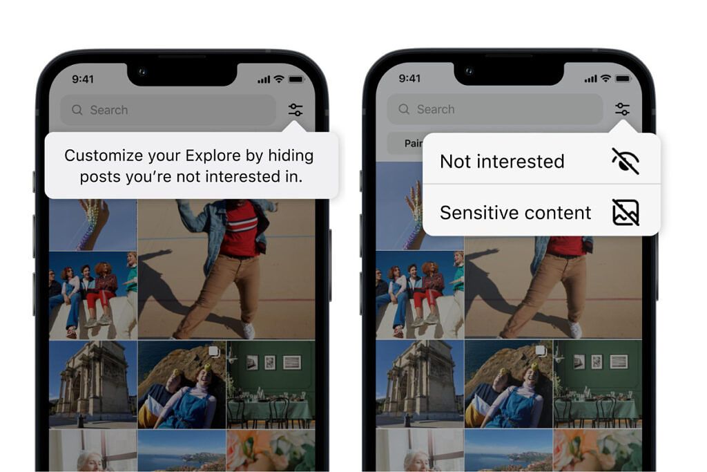
Instagram has been busy as of late, adding lots of new features to its platform. While the company currently does have a way to customize what ends up on the Explore page, it doesn’t have a precise way to refine the images and videos that pop up daily. Thankfully, the firm has announced that it is testing a couple of new ways to hopefully allow users to improve the content on the Explore page in the future.

Instagram Feed options

The new test will allow users to refine their feed further and, hopefully, have recommended content delivered that is more in line with what they are looking for. Users can currently refine their feed by selecting content and marking it as “Not Interested.” While this is a great solution, sometimes it can be slow if several items need to be marked at once. The new test allows users to mark multiple items at once, making it faster and more efficient to filter out content they don’t want to see. Furthermore, Instagram will take things a step further, allowing users to filter out suggested content using words, phrases, or even emoji found in the caption and hashtags. Currently, the more granular filtering option is not live in the test. Instagram did not offer a timeline for when it would become available.

Instagram Feed options

Recently, Instagram has put a lot of focus into creating a safe place for teens. Last week, it updated the Sensitive Content Control, showing less sensitive content by default to teens 16 years and under. The firm has also introduced age verification in the United States, requiring users to provide a valid form of identification when signing up for Instagram. But, being able to filter content will take things to another level. If this kind of filtering goes live, it could become an extremely powerful tool for the platform and its users.


Source: Facebook

The post Instagram will begin testing a potentially powerful content filtering tool appeared first on XDA.


from XDA https://ift.tt/GDbupj0
via IFTTT