
Google offers a variety of different apps on the Play Store and while a lot of these apps are pretty great, none of them stack up to the might of Google Photos. The machine learning-powered gallery app from Google offers a ton of useful features and Google keeps on improving the app with more features ever so often. However, the app hasn’t received a UI refresh in quite some time. Google rolled out the last redesign for the app all the way back in September 2018, which brought Google’s Material Theme to the app. Since then, we’ve only seen one significant change in the app’s UI — a new account switching gesture that was released late last year. Now, according to a recent report from Android Police, Google is rolling out a major redesign for Google Photos that gets rid of the hamburger menu and the search bar.

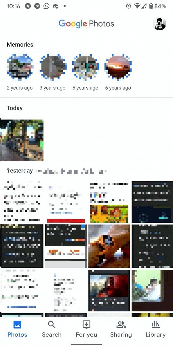
The updated design for Google Photos is currently rolling out as a server-side update and it brings two major changes to the app’s UI. First off, the search bar and the accompanying hamburger menu has been replaced with a Google Photos logo, giving the app a cleaner look. Right underneath it is the Memories section, followed by all your recent photos. Secondly, since the search bar and hamburger menu are now gone, all of the app’s features can now be accessed from the bottom bar. In order to accommodate the additional features, the bottom bar has also received a slight redesign and it now houses five icons, namely Photos, Search, For You, Sharing, and Library.


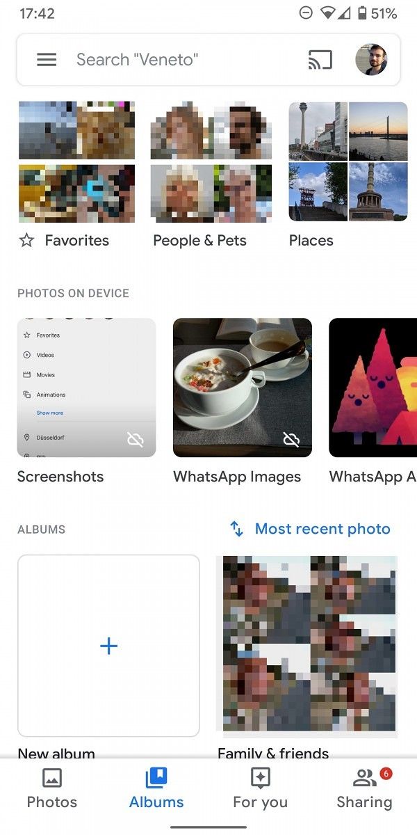
Tapping on the new Search icon in the bottom bar brings up a few suggests that are a bit more pleasing to look at when compared to the ones you’d get in the old interface. People & Pets previews are significantly larger, and places and things suggestions are accompanied by photos. These changes make the Search tab look a lot like the old Album tab. Scrolling down in the Search tab brings up specific search terms in the form of categories, like “screenshots”, “selfies”, “videos”, and more. On top of that, you can also access all your recently uploaded photos in the same tab.

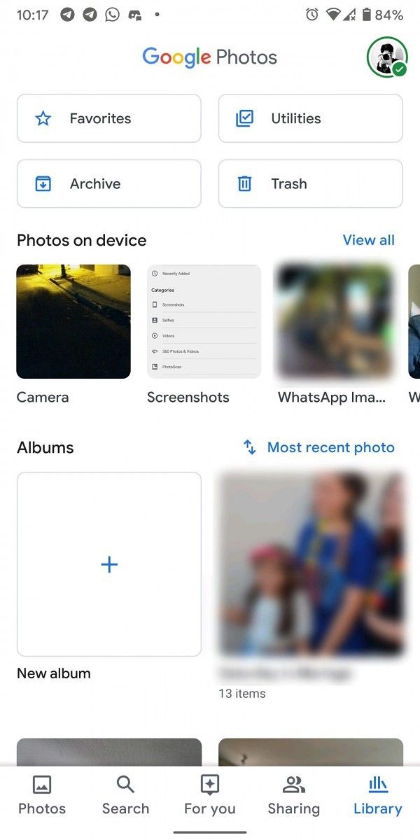
Since the Album tab has been removed in the new redesign, its content has been split into the Search tab and the Library tab. The Library tab also lists some of the items that were previously found in the hamburger menu, including device folders, the archive, trash, and some “utilities”. As mentioned earlier, the redesign is rolling out as a server-side update and it’s currently limited to a very small group of users. Even though I’m using the beta version of the app, I don’t see the redesigned UI on any of my devices. However, since the redesign has started appearing in the stable version of the app, we expect Google to roll it out to more users in the coming days. We’ll update this post as and when Google rolls out the new Google Photos UI to a wider audience.
Source: Android Police
The post Major Google Photos redesign removes hamburger menu and moves search to bottom bar appeared first on xda-developers.
from xda-developers https://ift.tt/2PLnUjH
via IFTTT
Aucun commentaire:
Enregistrer un commentaire