The launch of new Galaxy devices is always an exciting time for display tech enthusiasts. With Samsung Display still leading the industry’s progress in mobile screens, the new Samsung Galaxy S21 Ultra showcases the bleeding edge in mobile display technology and give us hints on what to expect from displays on phones released in the near future.
The latest panels aren’t always the best panels, however. While the technology may be improving, companies need to make sure that they keep their calibration quality in check. Sometimes technological improvements have introduced new problems: For example, high refresh rate panels introduced color shifting when the phone switched refresh rates, and software solutions had to be created to solve this problem. New emitter material and driver adjustments may also impact image quality. While the Galaxy S21 Ultra shows off Samsung’s newer OLED technology, let’s see if it also manages to improve its image quality.
The Snapdragon Samsung Galaxy S21 Ultra unit in this review was personally bought. Samsung did not compensate for this review in any way.

Now with less glare!
Samsung Galaxy S21 Ultra Display Pros & Cons
- Excellent peak brightness
- Good sRGB and P3 color accuracy
- Good contrast and tone mapping
- Can get dimmer than other OLEDs
- Improvements in grayscale color precision
- Adaptive refresh rate solution yields no color shift
- Lack of shadow detail at low brightness levels
- Banding is visible (even for 10-bit content)
- HDR10 content is oversaturated and too bright
What’s changed?
When compared to the Galaxy Note20 Ultra, Samsung hasn’t mentioned any huge changes. On paper, the panels seem extremely similar: Both are large QHD panels with support for up to 120 Hz refresh rates, and both advertise a next-generation LTPO panel with VRR (variable refresh rate) support. In terms of brightness, both also boast a peak of 1,500 nits. However, one major difference with the new Galaxy S21 Ultra is that it finally allows its 120 Hz refresh rate at the display’s native QHD resolution — previous Galaxy flagships were stuck with the FHD (1080p) render resolution if they wanted to use the 120 Hz high refresh rate mode. Unfortunately, I don’t have a Galaxy Note20 Ultra to investigate other potential differences, but Andrei from Anandtech found the panel in the Galaxy S21 Ultra to be even more power-efficient than the one in the Note20 Ultra.
“Variable” refresh rate
While the Samsung Galaxy S21 Ultra is advertised to have a “true” variable refresh rate solution, it still actually switches between discrete refresh rate modes. However, with the LTPO “VRR” panels of the Galaxy S21 Ultra and the Note20 Ultra, there are more refresh rate modes within the display driver than those that are exposed to the Android OS. Andrei from Anandtech also covers the display driver mechanism that is responsible for the panel’s finer-tuned refresh rate switching.
Methodology for gathering data
To obtain quantitative color data from the display, I stage device-specific input test patterns to the Samsung Galaxy S21 Ultra and measure the display’s resulting emission using an X-Rite i1Display Pro metered by an X-Rite i1Pro 2 spectrophotometer in its high-resolution 3.3nm mode. The test patterns and device settings I use are corrected for various display characteristics and potential software implementations that may alter my desired measurements. My measurements are typically done with display-related options disabled unless mentioned otherwise.
I use constant power patterns (sometimes called equal energy patterns), correlating to an average pixel level of about 42%, to measure the transfer function and grayscale precision. It’s important to measure emissive displays not only with constant average pixel level but also with constant power patterns since their output is dependent on the average display luminance. Additionally, a constant average pixel level does not inherently mean constant power; the patterns I use satisfy both. I use a higher average pixel level closer to 50% to capture a midpoint between both the lower pixel levels and the many apps and webpages with white backgrounds that are higher in pixel level.
I use the latest color difference metric ΔETP (ITU-R BT.2124), which is an overall better measure for color differences than ΔE00 that is used in my earlier reviews and is still currently being used in many other sites’ display reviews. Those that are still using ΔE00 for color error reporting are encouraged to use ΔEITP.
ΔEITP normally considers luminance (intensity) error in its computation, since luminance is a necessary component to completely describe color. However, since the human visual system interprets chromaticity and luminance separately, I hold our test patterns at a constant luminance and do not include the luminance (I/intensity) error in our ΔEITP values. Furthermore, it is helpful to separate the two errors when assessing a display’s performance because, just like with our visual system, they pertain to different issues with the display. This way, we can more thoroughly analyze and understand the performance of a display.
Our color targets are based on the ITP color space, which is more perceptually-uniform than the CIE 1976 UCS with much better hue-linearity. Our targets are spaced out roughly even throughout the ITP color space at a reference 100 cd/m2 white level, and colors at 100%, 75%, 50%, and 25% saturation. Colors are measured at 73% stimulus, which corresponds to about 50% magnitude in luminance assuming a gamma power of 2.20.
Contrast, grayscale, and color accuracy are tested throughout the display’s brightness range. The brightness increments are spaced evenly between the maximum and minimum display brightness in PQ-space. Charts and graphs are also plotted in PQ-space (if applicable) for proper representation of the actual perception of brightness.
ΔETP values are roughly 3× the magnitude of ΔE00 values for the same color difference. A measured color error ΔETP of 1.0 denotes the smallest value for a just-noticeable-difference for the measured color, while the metric assumes the most critically-adapted state for the observer so as not to under-predict color errors. A color error ΔETP less than 3.0 is an acceptable level of accuracy for a reference display (suggested from ITU-R BT.2124 Annex 4.2), and a ΔETP value greater than 8.0 can be noticeable at a glance, which I’ve tested empirically.
HDR test patterns are tested against ITU-R BT.2100 using the Perceptual Quantizer (ST 2084). HDR sRGB and P3 patterns are spaced out evenly with sRGB/P3 primaries, an HDR reference white level of 203 cd/m2 (ITU-R BT.2408), and a PQ signal level of 58% for all its patterns. All HDR patterns are tested at an HDR-average 20% APL with constant power test patterns.
Color profiles


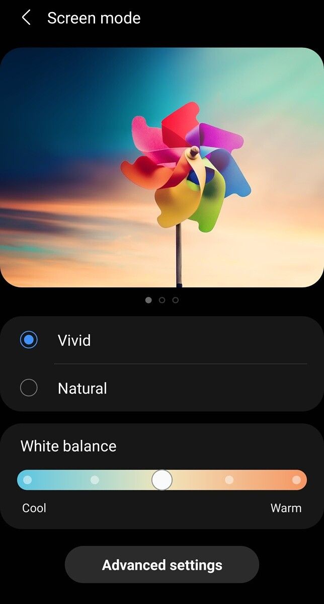
The Samsung Galaxy S21 Ultra (along with most other Android devices) maintains the same screen color mode configurations as its past two generations, with its Vivid and Natural profile. The Vivid mode was set as default on my Snapdragon unit.
The Natural profile is the phone’s color-accurate profile, and it targets the sRGB color space with color management up to the Display P3 color space. The white point of the profile targets D65/6500 K (with my measurements reading about ~6300 K), and its tone mapping targets a standard gamma of 2.20.
The Vivid profile is a color-boosted profile, which increases the saturation of colors on the screen. The profile’s target color space is about 36% larger than sRGB and is similar to Display P3 but with altered blues. Reds are boosted by about 24% and tinted towards orange; Greens are boosted by about 35% and tinted towards cyan; blues are boosted by about 18% and tinted heavily towards cyan. The resulting colors are oversaturated and slightly skewed in hue, but many users may prefer this for its punchiness. The white point is a little colder, targeting approximately 6700 K in its default setting. For this profile, an option is provided to adjust the color temperature of the profile. Individual RGB-channel adjustments (polynomial color corrections) are also provided under Advanced settings. The profile’s tone mapping also targets a standard gamma of 2.20, but it diverges to a higher value at higher brightness since the profile does not normalize display luminance in response to content APL.
Brightness

Peak luminance vs content APL
New Samsung Galaxy flagships typically come with new peak brightness records for mobile OLEDs. However, with the Samsung Galaxy S21 Ultra, we’re seeing brightness figures that are similar to the Note20 Ultra. That is, we’re seeing about 900 nits at full-screen white (100% APL), down to 1,500 nits at a tiny 1% APL. Most light-themed apps sit at about 75-85% APL, at which the Galaxy S21 Ultra can output about 1,000 nits. Needless to say, these are still extremely impressive brightness figures. Note that the Samsung Galaxy S21 Ultra (and most other Android devices) can only reach this peak brightness in high ambient lighting, such as under sunlight. Otherwise, the peak brightness for the manual brightness range is only about 400 nits for full-screen white.
When at its peak, one caveat with the display brightness is that it sacrifices image contrast for maximum white luminance. The Galaxy S21 Ultra’s peak brightness varies significantly with content APL; the phone can pump more current to bright regions of the display when the rest of the display isn’t emitting much light. While this has the advantage of letting small bright regions stand out more, it can completely mess with the rendering of color tones, making details in images harder to see. For this reason, some OLEDs disable this brightness-boosting (or brightness-reducing, whichever way you want to look at it) mechanism by limiting the current to the panel and normalizing the brightness to that of full-screen white’s (max power draw), regardless of content APL. This behavior is now implemented into the Natural (or similar) profile of most phones now for improved color tone accuracy. However, some phones, such as the Samsung Galaxy S21 Ultra, continue to allow the brightness to vary at peak brightness, likely for the spec sheet — I’ve found that displays that control the brightness response to APL at peak brightness to be overall more legible under sunlight. The OnePlus 8 Pro, which normalizes its peak brightness (to only about ~720 nits) and then boosts its midtones, is still among the best phone displays I’ve seen for sunlight viewing; the Google Pixel 5 performs similarly.
At its lowest brightness setting, I noticed that I was getting two separate readings. If Adaptive Brightness was disabled, the display could get as dim as 1.6 nits for full-screen white, which is excellent — most other OLEDs only go down to about 1.8–2.0 nits. However, when Adaptive Brightness is enabled and the brightness slider is set to its minimum, the Galaxy S21 Ultra’s display could get as low as 1.2 nits for full-screen white, which is impressive. Most other displays cannot get this dim without the help of some sort of dark filter overlayed in software. The Samsung Galaxy S21 Ultra also does this without significant detriment to picture quality. Kudos to Samsung here.
Power consumption

Compared to the two-year-old Galaxy S10, we see that the Galaxy S21 Ultra is remarkably more power-efficient in regards to luminous efficacy. At the Galaxy S10’s peak full-screen brightness, which is about 750 nits, the Galaxy S21 Ultra consumes almost a whole watt less than the S10 — about 25% less power — even when the Galaxy S21 Ultra has a ~20% larger screen area. When the Galaxy S10’s power figures are scaled up to match the screen area of the Galaxy S21 Ultra’s, the difference is even more staggering; in this scenario, the Galaxy S21 Ultra then consumes about 37% less power and can output about 1,000 nits for the same power as the scaled S10’s peak 750-nits brightness.
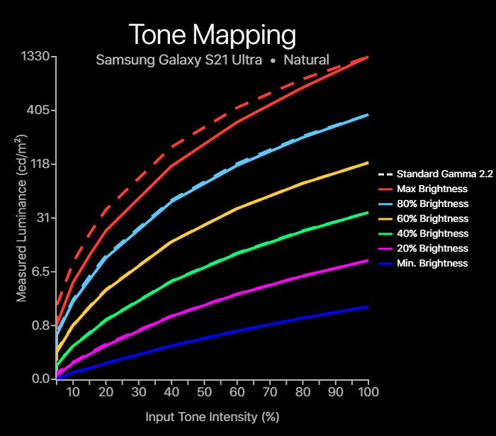
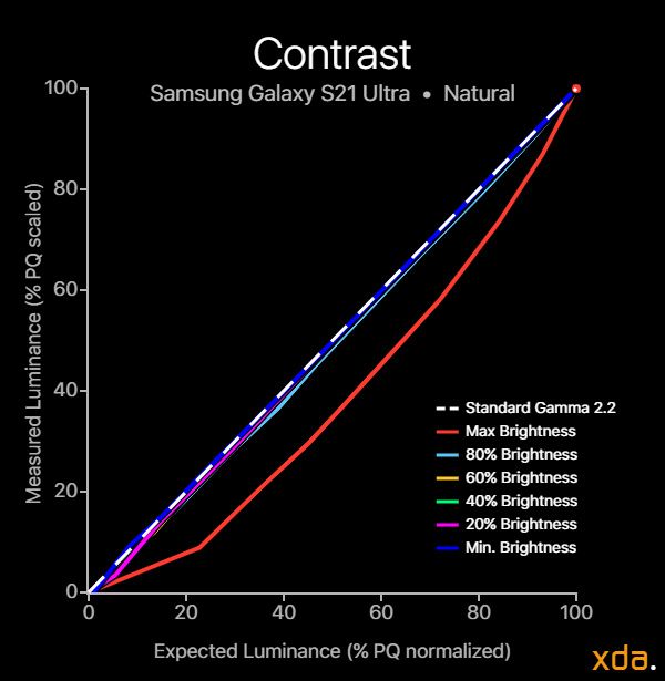
Contrast and Tone Mapping


Measured at 40% APL (~27% Target ADL)
As previously discussed, the Natural profile of the Samsung Galaxy S21 Ultra normalized the display brightness response to content APL. This is a crucial step in producing a tight transfer function (tone map) calibration; without it, image contrast will vary depending on the average brightness of the content, which can be observed in our contrast and tone map charts for the Vivid profile below. The Natural profile produces excellent tonal accuracy towards the standard 2.20 power gamma for its manual brightness range, thanks to the brightness normalization. But at its peak brightness, when high brightness mode is activated, Samsung disables the brightness normalization so that the panel can output the brightest whites that it can. This has the drawback of impacting tonal accuracy, and our measurements show that, at peak brightness, the Galaxy S21 Ultra renders color tones far darker than intended and details in images can become lost.
At low brightness, the Natural profile maintains its tracking of the 2.20 gamma power. Although this seems accurate on paper, it’s not typically desirable at low brightness levels. The differences between the darkest shades of colors become really small at these brightness levels, causing a loss of detail and “black crush” even for a display that perfectly tracks a gamma power of 2.20. Thus, the display calibrators should instead use a lower, brighter gamma power for the first several tone steps for improved display legibility at low brightness. Phones such as the Google Pixel 5 and Apple’s iPhones are good examples of displays with excellent shadow legibility at low brightness due to their tone mapping behavior.


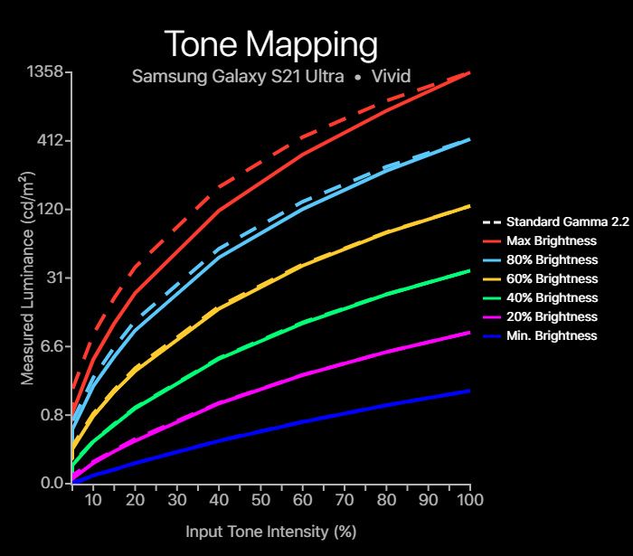
Measured at 40% APL (~27% Target ADL)
The Vivid profile does not employ brightness normalization, so its image contrast varies with the display brightness and the content APL. It properly tracks a 2.20 gamma power for low-to-medium brightness levels but begins to noticeably track higher above about 400 nits. This only really becomes an issue at peak brightness (high brightness mode), but I wish Samsung would just keep it static to maintain its image contrast across its brightness range. For Vivid mode, Samsung could track a static 2.40 gamma power instead so that it has increased contrast across the board, instead of only at high brightness levels.


Gradient banding for the Natural profile
Gradient banding has always been a complaint of mine for Samsung devices. Even with the brand-new Galaxy S21 Ultra, bit-depth quantization continues to be subtlety present for the display in the Natural profile. Even for 10-bit content, whose sole existence in the display world is to address quantization artifacts, the Galaxy S21 Ultra still exhibits some banding. The main offender seems to be a strip in the midtones that is tinted red at medium to high brightness levels. It’s not as big an issue as it was in the S10 display, but it’s still there when it hasn’t been a complaint of mine for any other major OEM in recent times.
White Balance and Grayscale Color Precision


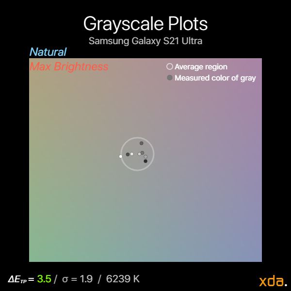
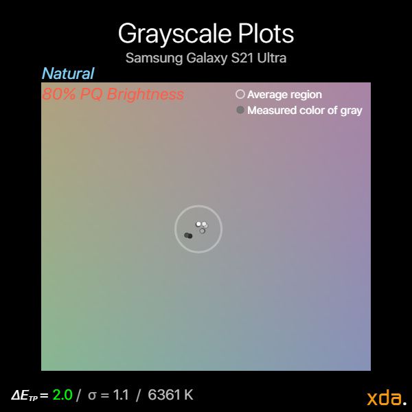
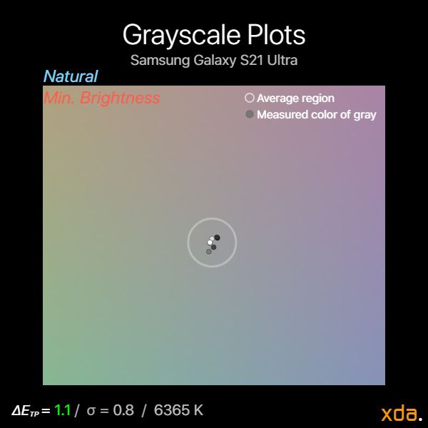
Grayscale plots for Natural profile, 120 Hz
The grayscale color spread on the Samsung Galaxy S21 Ultra is decently tight and well-controlled in the Natural profile. There is a gap that my plots are missing which can be seen from the red strip in my gradient banding photos in the previous section, but in general, there’s no jarring tint going on with the display. I’m happy to see that Samsung has improved in this regard: The last Galaxy display that I reviewed, the Note10, did not perform too well in its grayscale color precision. However, as with all Samsung Galaxy displays that I’ve reviewed, they are calibrated slightly too warm in their Natural mode, and our Galaxy S21 Ultra measured at about 6300 K in its grayscale and white point.
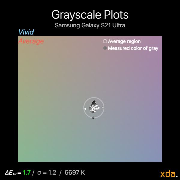


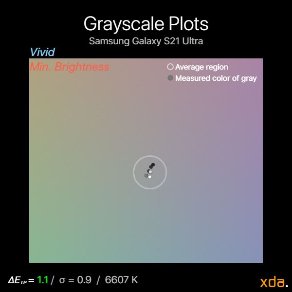
Grayscale plots for Vivid profile, 120 Hz
The Vivid profile’s grayscale color spread is a little tighter, which can be expected from a color profile with less gamut compression. There is also less color banding in this profile, and the white point and grayscale measures at about 6700 K by default.
Refresh rate color difference
From my observations after spending time with the display, I have not noticed alterations to the image quality when the display changed refresh rate modes when in use. This is not to say there aren’t any differences between the refresh rate modes. There are subtle color calibration differences between the 60 Hz and 120 Hz display modes, but it seems that the OS is smart enough not to switch when the difference may be noticeable. By tracking the current refresh rate of the Android OS, I found that the Galaxy S21 Ultra does not switch modes under a certain system brightness and ambient brightness. This is only for the refresh rate modes that are exposed to Android; the driver-level refresh rate modes exhibited no visible color shifting to my eye, however, it’s hard to properly assess this without knowing when the display is actually changing its driver refresh rate since it isn’t apparent to the OS.
Color Accuracy


sRGB color accuracy plots for Natural profile
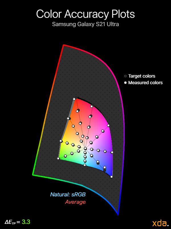
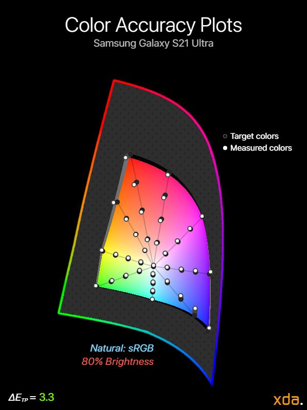
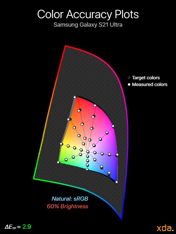
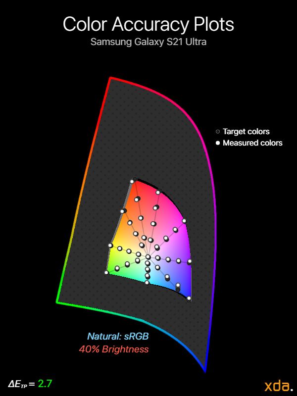
Samsung’s Galaxy S21 Ultra generally shows excellent sRGB color accuracy in its Natural Profile for its manual brightness range (ΔETP = 2.7). As a rule of thumb, ΔETP values under 3.0 can be considered reference-quality. However, although the profile’s average color errors are very low, there are a couple of high color errors at mid-to-high display brightnesses that are noteworthy. Between 60%-80% PQ brightness, high-saturation reds in sRGB take on a slightly orange tint (ΔETP ≈ 10), and the gamut is expanded towards orange in this region while red-to-pinks are somewhat constrained. At the same brightness range, a region of medium-high blues are skewed in hue towards purple, which is odd given the rest of the blues appear fine.
At maximum brightness, we see a trend of oversaturation across the gamut. This is actually desirable behavior since it offsets some of the screen gamut compression from high ambient lighting when the display is at its peak brightness. Most of the colors retain the same hue, which is excellent. But just like in its manual brightness range, reds are heavily skewed towards orange (although since oranges seem to be okay, this means that skin tones aren’t likely to be noticeably distorted).
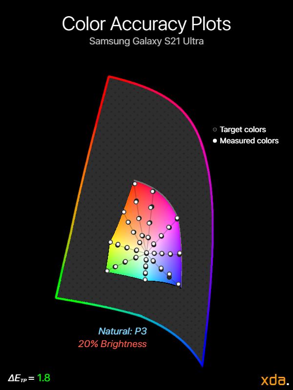
Low brightness color calibration is excellent and better than on most other mobile displays that I’ve seen. Most phones show a compressed gamut at low brightness, which isn’t the case for the Galaxy S21 Ultra. However, the Galaxy S21 Ultra still has an issue with shadow legibility at low brightness.


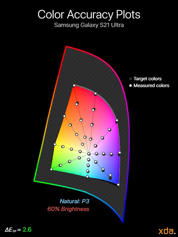
Display P3 color accuracy plots for Natural profile
The Natural profile’s Display P3 color calibration seems to be slightly more accurate than its sRGB color calibration. Within the Galaxy S21 Ultra’s manual brightness range, the profile yields an average color error ΔETP of 2.4 for Display P3, which is excellent. The Display P3 calibration does not have the issues with reds that are present in the sRGB calibration, but the error in medium- to high-saturation blues is still there. This should provide good future-proofing when Display P3 content inevitably becomes more common within the Android ecosystem.
HDR Playback


Measured at 20% APL
~400 nit frame-average light level (HDR10 1000) / ~900 nit frame-average light level (HDR10 4000))
HDR content (in the form of HDR10 and Dolby Vision) is becoming more and more prolific every day. There are now plenty of HDR titles on every streaming platform, and we’re only now seeing the tip of the iceberg. Samsung’s cameras also allow for HDR10+ video recording, which can be played back right on the Galaxy S21 Ultra, and with that, content creators should expect a degree of accuracy from their playback device. There’s still a ton of untapped potential in our current standards, and I expect many future improvements and revisions, such as a standardized form of Dolby Vision IQ. For our HDR review, we’ll be looking at the current de-facto HDR10 standard playback using the ST. 2084 (aka Perceptual Quantizer, or PQ) absolute transfer function. HDR playback in the Natural and Vivid profiles on the Galaxy S21 Ultra is identical.
In terms of peak brightness, the Samsung Galaxy S21 Ultra advertises 1,500 nits peak, which is plenty for HDR10-1000 (HDR10 at 1,000-nits peak) content. From my measurements, I found that the Galaxy S21 Ultra can hit 1,480 nits at a 20% window size (which is also the typical APL for HDR), so Samsung’s claims of 1,500 nits for HDR is genuine. It’s also actually quite modest: At 10% APL, the Galaxy S21 Ultra can hit 1,580 nits, and at 1% APL, it managed to output 1,680 nits. These figures aren’t quite viable yet for HDR content mastered at 4,000 nits, but it’s respectable progress nonetheless, and it allows headroom for proper 1,000-nit highlights at higher APLs.
Our contrast chart shows how the Galaxy S21 Ultra reproduces the standard PQ curve when playing back HDR10 content. We can see that the Galaxy S21 Ultra renders HDR10 content much brighter than standard when the display is at max brightness (which is the brightness setting that HDR10 content is supposed to be played back at). However, I suspect that Samsung may just not be following convention, and perhaps manually adjusting the display brightness to 1,000 nits peak would result in an accurate HDR10-1000 PQ curve. Note that the display’s rendering of the PQ curve depends on the peak luminance metadata of the HDR10 content (1000 nits or 4000 nits peak); consumer displays cannot currently hit 4,000 nits (and some cannot hit 1,000 nits), so the display gently rolls off towards its peak brightness instead. The Samsung Galaxy S21 Ultra is the first Android phone I’ve tested that actually changes its tone mapping depending on the metadata of HDR content, which is excellent to see (previous generations may have as well, but I did not test this) — it’s just a shame to see that it doesn’t seem to follow the PQ curve properly. Furthermore, I found that the first 10% of the curve gradually became brighter the longer the Galaxy S21 Ultra displayed HDR content; the spike at the bottom of the chart shows this behavior at one instance when the display rendered the tones about 0.3 nits brighter than intended, which is a huge difference in shadows.
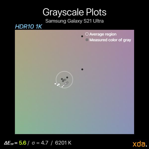
In grayscale color precision, the Samsung Galaxy S21 Ultra performs mediocrely for HDR playback. Its shadows are tinted towards magenta, and the color temperature of the rest of the grayscale points are much warmer than standard, with highlights tinting towards yellow. The standard distance σ of 4.7 is remarkably high, surpassing the value for a non-critical noticeable difference (ΔETP > 3.0) for the collection of grayscale points.
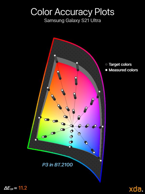
The Galaxy S21 Ultra also sees issues in color accuracy for HDR content. Our color accuracy chart shows the Galaxy S21 Ultra oversaturating all colors within the P3-BT.2100 gamut, and the white point tint towards yellow is also visible. This oversaturation goes hand-in-hand with the overly-bright rendering of the PQ curve.
Overall, the Samsung Galaxy S21 Ultra provides an extremely vibrant HDR viewing experience — one that is brighter and more colorful than standard. It may not provide the most true-to-cinema experience, but an upside to the brightness and color surplus is that it can improve your HDR viewing experience in brighter conditions, and not limit it to just dark rooms.
Final Remarks on the Samsung Galaxy S21 Ultra’s Display
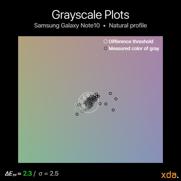
The Samsung Galaxy S21 Ultra is truly a state-of-the-art panel that addresses many of the previous shortcomings of high refresh rate OLEDs on smartphones. In terms of calibration, the Galaxy S21 Ultra maintains the color accuracy that is expected from a phone of its caliber. However, I’d like to see finer tuning of shadow details at its lower brightness settings, which I’m seeing other Androids now paying more attention to. On the other end, I’d also like to see Samsung improve its tonal tuning at max brightness instead of just trying to compete for the highest figure of nits possible. My Snapdragon Galaxy S21 Ultra unit also showed excellent panel uniformity at low brightness and very little grayscale color tinting, which is the opposite of my experience with my previous Note10, which was terrible in both regards. And finally, I actually now find the state of the curve to be bearable: Even with bright content, the curve yielded little-to-no noticeable distortion at the edges when looking at the display head-on — I wouldn’t mind this curve on a daily driver.
| Specification |
Samsung Galaxy S21 Ultra |
| Type |
Flexible OLED
PenTile Diamond Pixel
|
| Manufacturer |
Samsung Display Co. |
| Size |
6.2 inches by 2.8 inches
6.0-inch diagonal
17.3 square inches
|
| Resolution |
3200×1440
20:9 pixel aspect ratio
|
| Pixel Density |
364 red subpixels per inch
515 green subpixels per inch
364 blue subpixels per inch
|
| Distance for Pixel Acuity Distances for just-resolvable pixels with 20/20 vision. Typical smartphone viewing distance is about 12 inches |
<6.7 inches for full-color image
<9.4 inches for achromatic image
|
| Black Clipping Threshold Signal levels to be clipped black |
<0.8% @ max brightness
<1.2% @ min brightness
|
| Specification |
Natural |
Vivid |
| Brightness |
Minimum:
1.6 nits
Peak 100% APL:
885 nits
Peak 50% APL:
1143 nits
Peak HDR 20% APL:
1484 nits
|
| Gamma Standard is a straight gamma of 2.20 |
Average 2.25
2.23–2.31
|
Average 2.28
2.23–2.33
|
| White Point Standard is 6504 K |
6270 K
ΔETP = 2.4
|
6668 K
ΔETP = 1.7
|
| Color DifferenceΔETP values above 10 are apparent ΔETP values below 3.0 appear accurate ΔETP values below 1.0 are indistinguishable from perfect |
sRGB:
Average ΔETP = 3.9
P3:
Average ΔETP = 4.3
|
36% larger gamut than sRGB
+24% red saturation, tinted orange
+35% green saturation, tinted cyan
+18% blue saturation, tinted cyan
|
The post Samsung Galaxy S21 Ultra Display Review: A technical (rather than visual) step forward appeared first on xda-developers.
from xda-developers https://ift.tt/3q9QNWM
via
IFTTT


